
For my new website I decided to design a new header image. Me, a guy that is not very artistic, decided to hand draw this image. These are the steps that I took.
My first step was to design my image. I didn’t spend that much time on this stage of my draft because it was a quick design of what I was going to do. I decided to implement the four major North American sports (Baseball, Ice Hockey, Football, Basketball).

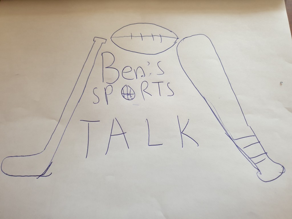
This is the final sketch after I redrew the first draft with more detail. Switching the position of the hockey stick and baseball bat seemed more natural. Adding the baseball and the hockey stick seemed appropriate and it did a good job of filling some whitespace. Overall, I think it looked fine.

I always seemed to mess up my sketches when I tried to colour them by hand so I decided to scan my drawing and upload it into photoshop. After doing that, It was much easier to colour and the program made sure I didn’t leave any white spots. Using the paint bucket tool made it so much easier to colour in a certain area. This was for sure a pleasant experience.

This turned out to be my final draft and to be honest, I think it looks pretty good. It was also the first time using photoshop and from now on, I am going to use it more often. I tried my best to make the best of any art skills I have and it turned out to be better than what I expected.
